|
|
Post by René on Feb 15, 2019 19:23:05 GMT
It’s the ‘A Better Tomorrow’ branding. Like Philip Morris, BAT is now concerned with our health and future.  In the 1950s, pretend doctors endorsed cigarette brands on television. You could smoke almost anywhere. Curiously, those halcyon days started to fade when the Marlboro Man died of cancer.
Carl, I remember the days when smoking was still generally accepted. When my parents had a party, everyone smoked. There were glasses with cigarettes on every table. Politicians still smoked on television. And I am talking the 70s and 80s. I used to smoke the Marlboro faggies myself but I'm glad I quit (14 years ago)! |
|
|
|
Post by mikael on Feb 16, 2019 12:24:10 GMT
I really expected that the 2019 Ferrari would look like the 2019 MotoGP Ducati; dark red, typical high-gloss paintwork. It is interesting if this matte paint-finish of the Ferrari really has some kind of aerodynamic influence. But I really don't think so ... Think about a dolphin's skin, which likely is optimal regarding hydrodynamic resistance. It's very smooth - and almost with a "high-gloss finish".
|
|
|
|
Post by Carl on Feb 17, 2019 1:42:09 GMT
I think the disregard of traditional colors displayed by almost every team (the Ferrari red/the McLaren orange) is caused by an indifference remarkable only to purists like us. What was once national pride is now sponsor's choice. Imagine a team sponsored by Sunrise Sushi... (actual logo)  ...or Vermont Pure Maple Syrup (actual logo)
If the sponsorship was lucrative enough, neither would have offended reprobates Ecclestone and Mosley but beyond pride, national colors were also an effective barrier against budgetary excess. Their reappearance could assist a return of the sport from its current addiction.
|
|
|
|
Post by Jamie on Feb 17, 2019 7:34:09 GMT
I really expected that the 2019 Ferrari would look like the 2019 MotoGP Ducati; dark red, typical high-gloss paintwork. It is interesting if this matte paint-finish of the Ferrari really has some kind of aerodynamic influence. But I really don't think so ... Think about a dolphin's skin, which likely is optimal regarding hydrodynamic resistance. It's very smooth - and almost with a "high-gloss finish".
I was disappointed with the colour as well Mikael and the Ducati looks brilliant in the darker red colour. I remember Red Bull saying that the matte finish helps in much the same way that dimples help a golf ball but I can't remember the science behind it. I hope that matte paintwork is a passing fad though as I absolutely hate it, there has been a bit of a trend for it io high end road cars in the UK over the past couple of years and I think it looks God awful. |
|
|
|
Post by Jamie on Feb 17, 2019 7:35:54 GMT
I think the disregard of traditional colors displayed by almost every team (the Ferrari red/the McLaren orange) is caused by an indifference remarkable only to purists like us. What was once national pride is now sponsor's choice. Imagine a team sponsored by Sunrise Sushi... (actual logo) ...or Vermont Pure Maple Syrup (actual logo)
If the sponsorship was lucrative enough, neither would have offended reprobates Ecclestone and Mosley but beyond pride, national colors were also an effective barrier against budgetary excess. Their reappearance could assist a return of the sport from its current addiction.
Jeeezz...this made me laugh Carl. Surely they cant be real.........   |
|
|
|
Post by Carl on Feb 17, 2019 17:13:25 GMT
I think the disregard of traditional colors displayed by almost every team (the Ferrari red/the McLaren orange) is caused by an indifference remarkable only to purists like us. What was once national pride is now sponsor's choice. Imagine a team sponsored by Sunrise Sushi... (actual logo) ...or Vermont Pure Maple Syrup (actual logo)
If the sponsorship was lucrative enough, neither would have offended reprobates Ecclestone and Mosley but beyond pride, national colors were also an effective barrier against budgetary excess. Their reappearance could assist a return of the sport from its current addiction.
Jeeezz...this made me laugh Carl. Surely they cant be real.........   They are (or were initially) actual logos. 
|
|
|
|
Post by charleselan on Feb 17, 2019 18:12:30 GMT
Quite a few things going through my mind over the past days, so please excuse me if I begin too ramble.
Quite agree about the colour of the MotoGP Ducati Mikael; those machines were always a lovely shade of red, something we used to call blood red, which is what a Ferrari should be! I have great unease about the Philip Morris identification on both the Ducati and the Ferrari, subversive and totally lacking in integrity by both teams as well as McLaren with the BAT link; quite disgusting in fact.
I have noticed also that some of the so called specialist motor sport press are now calling the finish on the Ferrari "Matte", talk about aggrandisement; a none gloss finish was always known in the English speaking world as "matt", nothing more nothing less. Quite right Jamie, it looks flaming horrible, as do the so called up market road cars with a similar style; they look unfinished to me and I bet they show up finger prints like nothing else.
Coming back to the new Alfa Romeo which on first glance and from a distance looked plum coloured which of course it was not. Not sure what the actual colour of the decoration was as it is hard to define from the photos. However I have really grown to like it, but sadly it was just a special Valentines Day special. I just hope that the Alfa is a glorious shade of dark red and gloss, but have a feeling it will not be.
Another thought that passed through my head was the fact that it would be in the parent companies interest for the Alfa Romeo to feature ahead of Ferrari as a marketing tool, for the simple reason that Alfa are somewhat more of a mainstream brand, and wouldn't it be great if it kicked some MB and Renault a*se.
|
|
|
|
Post by chrisb on Feb 18, 2019 5:43:33 GMT
I always thought Ferrari's "colour" was scarlet - which is to say red with a tinge of orange, but since becoming 'influenced' by a tobacco company I am no longer clear what colour this means -
Some sponsors bring a lot more than money, be it good or bad, and historically we have had some brilliant colour schemes and some dreadful ones, favourite will always be the Lotus [the real one] Black and Gold, the worst I am not sure about, possibly the BAT with it's dual colour scheme, not sure
|
|
|
|
Post by Jamie on Feb 18, 2019 6:59:32 GMT
For me the Honda ‘earth’ livery was the worst......terrible.
|
|
|
|
Post by robmarsh on Feb 18, 2019 7:12:30 GMT
This matte or matt finish on cars is "bloody 'orrible" to say the least. I didn't mind it on Red Bull because I don't like them anyway, apart from Max, but it is too awful to see it on a Ferrari. I have seen some road cars, notably BMWs and it looks terrible and cheap.
I think it was originally marketed as "stealth", something stolen from the military lexicon. This stealing of military terms like "pulling the pin" and some sports star is well decorated actually gets my goat. To me it trivialises the dangers that front line military personal go through.
|
|
|
|
Post by mikael on Feb 18, 2019 13:12:39 GMT
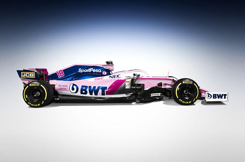
Just a "stray thought": interesting how the colours of the 2019 "Racing Point" somehow are approaching those of the 1992 Brabham ...


|
|
|
|
Post by René on Feb 18, 2019 16:57:52 GMT
Well, obviously I am alone on this one but I do like the new Ferrari livery. It's different and the car looks like a Merc beater to me.
The matt paint has nothing to do with aero or aesthetics. The only reason is weight. The matt paint saves just under one kilogram. Sounds like nothing but it shows Binotto and his team left nothing untouched that could improve the performance of the car. Forza Ferrari!  |
|
|
|
Post by René on Feb 18, 2019 17:09:01 GMT
The matt Ferrari made a shiny start of the test session today!  Fastest by quite a margin on all types of tyres and by far the most laps completed. Only Sainz in the McLaren came close (0.4s) at the end, albeit on a softer compound tyre. I know it's early days but the glory runs that Ferrari used to do is really something from the past. They haven't done that for years. The SF90 is fast straight out of the box, that's for sure.
-
Unfortunately this cannot be said about Williams who didn't compete at all! They will start testing on wednesday earliest which doesn't sound very promising.
On the other hand, I read about their new title sponsor Rokit on Autosport Plus and that sounds very good. Not a vague company like Rich Energy and a nice touch is that the CEO used to work on Alan Jones's car as a Goodyear tyre specialist. There's serious money there with serious people. I hope for Williams this comes good.
|
|
|
|
Post by Carl on Feb 18, 2019 17:46:51 GMT
I think the trend of flat (or matte) paint is just that, a trend, and one without purpose.
An unpolished jewel is dull.
|
|
|
|
Post by René on Feb 18, 2019 19:13:49 GMT
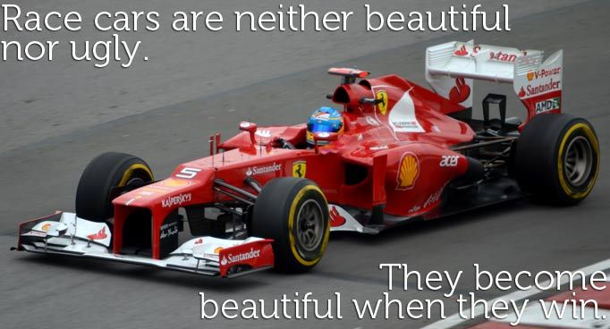
I think the trend of flat (or matte) paint is just that, a trend, and one without purpose. An unpolished jewel is dull. Ah well Carl, maybe. But in the end I only care if it wins. And in defence of my favourite team, I think Ferrari is the last team that should be critisized for their livery. They are the ONLY team that still races in the national colour. And as Enzo Ferrari once said:  |
|